


why does typography matter to your project?
Indulge me with this example.
You’re traveling, and you get off the train in Milan. You’ve been looking forward to this visit for a while and can’t wait to do a little shopping and see the sights. You get off the train, look left, and look right, but nothing in the area jumps out at you, and you don’t have a map or a phone with you. You decide to make the best of it and just pick a direction and start walking. Before long, you feel worn out and deflated, so you re-trace your steps, get back on the train, and go back to your hotel.
This is a bit like publishing your content without good typography and layout design. The reader arrives, and they’re looking forward to the experience; but they don’t have a map and before long they tire and lose interest.

Typography is the art of arranging type and content on printed (or digital) media.
Good typography will allow your reader’s mind to relax and focus on your message. When content is well laid-out, the brain can intuitively understand where to focus, and can more quickly absorb the content.
Like any art, it can be subjective. The field is continually changing, but certain principles remain because they’re rooted in human cognition.
Some elements are so fundamental that they’ve been ingrained in us since school. For example, how to use headers, sub-headers and paragraphs to convey hierarchy of importance; how to indent or leave space between paragraphs and use a full stop to end a thought; how 12 is a standard point size for essay submissions at school, and how serif fonts (with the little feet) are good for print while sans serif (no feet) works well for digital. Those are a few of the memorable best practices from my youth that are still generally true.
Well-chosen typefaces and design elements can influence moods and enhance memorability and retention.
There is an interesting and very public example of the effect of poor typography, where in 2012 a group of scientists released their findings for a much anticipated study, and the world had more to say about their font choice than they did about the results they shared.
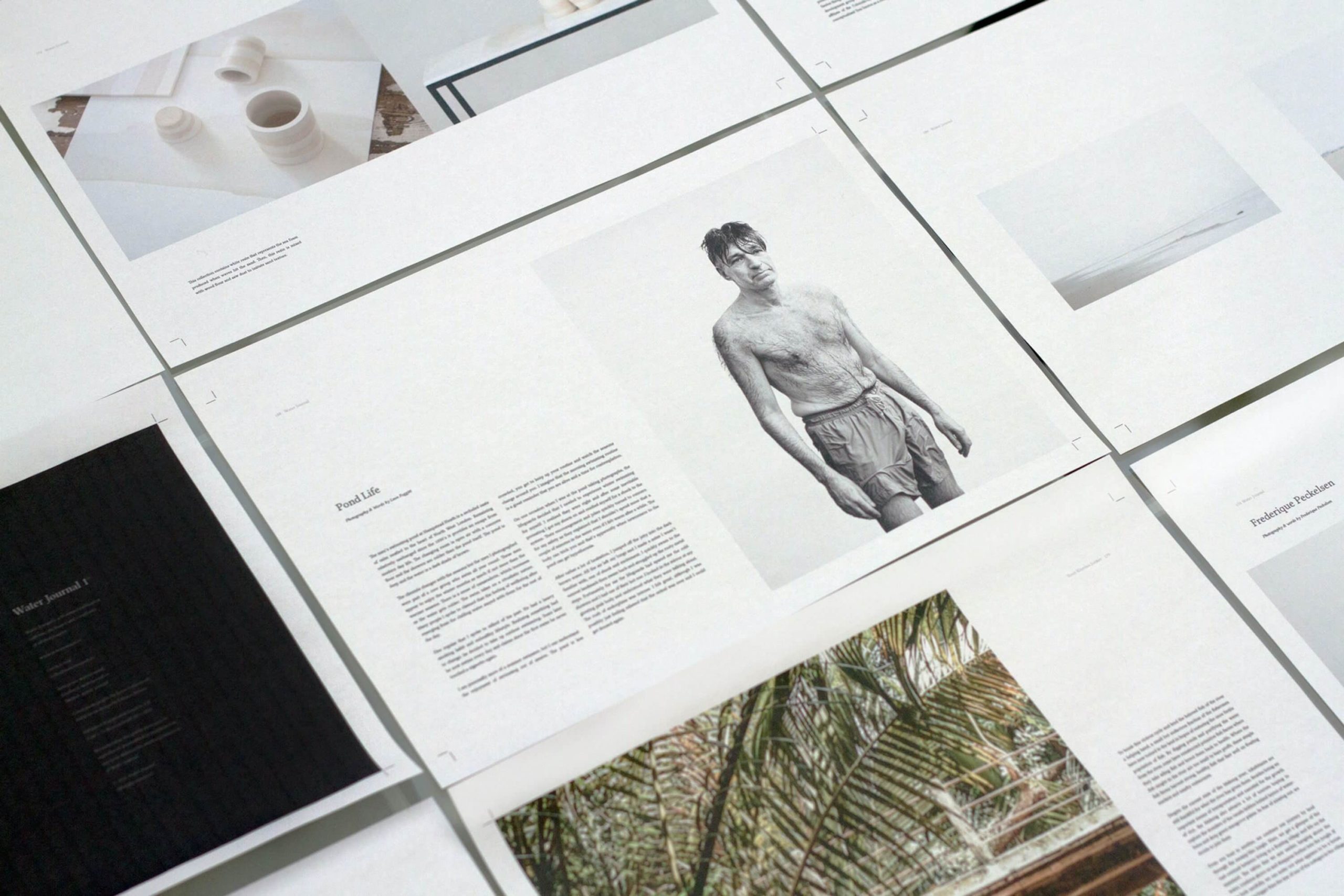
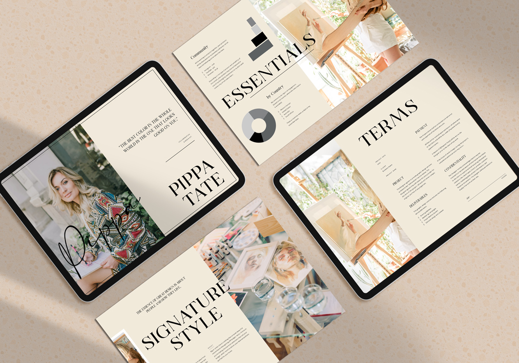
I’ll leave you with two simple visual illustrations of good and less interesting typography and layout design.
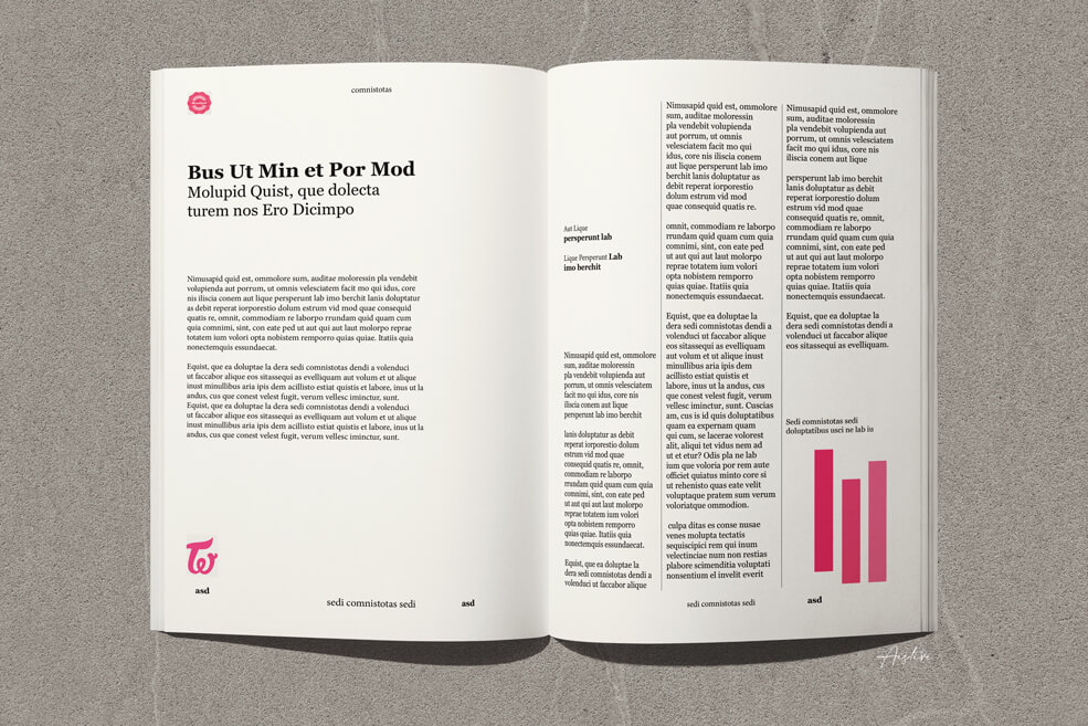
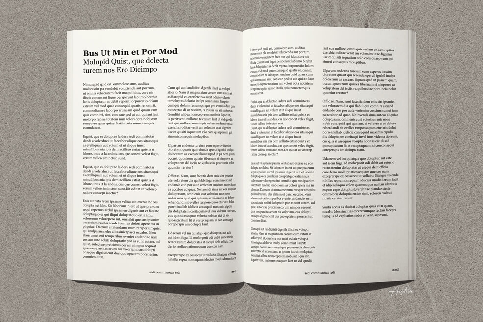
Which appeals most to you?


+ COMMENTS