


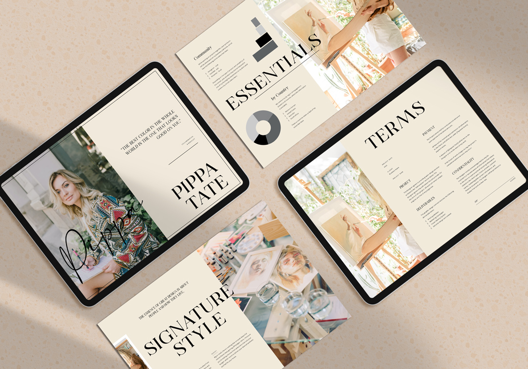
Things I look for when designing a layout
This is written with business owners in mind; those who are looking to DIY their design work (for good, or for now). With that in mind, this can still be helpful as an overarching check-in for designers, but it’s not intended to be a comprehensive how-to guide.
Things I look for when designing a layout are similar to what I look for when I’m scanning a breakfast menu.
It goes something like this:
- Scan top to bottom and front to back, for the right time of day (breakfast, lunch, dinner, drinks).
- Scan for my favourite dish or drink (always smashed avo and iced long black, sometimes mimosa).
- Look at the details and price (the fine print) – what’s included is painting a picture in my mind of whether it will be enough, or whether I have to go to Step 4…
- Check the add-ons.
I’m not alone in this approach. We all know the general layout and how a breakfast menu works, and because of that, we find it fairly easy to run through Steps 1 to 4 without thinking about it.
Organising a document for readability and enjoyment is similar in a lot of ways. There are certain details that your readers are naturally looking for, that you want to make easy for them to find (aka. you want to prioritise their appearance and placement).
A few tips when working with text
- Does the font size, colour, style and spacing make for easy reading?
I have a short post about that, with a visual example, here.
- Paragraph length and context – is it too wordy for the context?
You wouldn’t expect paragraphs on a menu, and that’s intentional. When your stomach’s growling and you haven’t had coffee yet, who wants to read prose about the origin of your avocado and how the oranges were squeezed for your mimosa? Similarly, if you’re preparing a “Quick Reference” document for your clients – keep in mind that it’s meant to be “Quick” or you’ll want to call it something else.
If you know it’s too long, can you cull some words or break it up into more digestible pieces?
- Pay attention to the content. What is your document or design about? Choose fonts that are either on-brand (check your brand style guide), or that are complementary to the subject of the content or people who will be reading it. For example, if it’s content for children, you may choose a type that’s playful and larger; if it’s content from a traditional professional group like lawyers, engineers or accountants, then sticking with traditional fonts can help carry a sense of trustworthiness and stability.
When working with imagery
- Consider using a grid to balance out your text, white space, and images. It sounds dull, but you can be creative with this, approaching it horizontally or vertically, in thirds, quarters or eighths.
- Be aware of visual weight and balancing out your pages. People naturally seek balance. If your layout is lopsided, it can distract readers or make them feel uneasy and lose interest.
For example, if I have too much avo for my toast, I may not be as attentive to the conversation at the table, while I figure out how I’m going to navigate my breakfast.
A few tips – darker colours, block shapes, thicker lines, and larger images carry more weight. You can balance these out with lighter colours or white space, a few smaller images on the opposing side of the page, or moving objects closer to the horizontal or vertical axis.
- If you have text over the top of imagery, make sure it’s readable. Add contrast between the text and image, pay attention to where you place the text so that you’re not covering important parts of the image, or consider blurring the image or using a shape overlay that you can place the text on top of. There are a lot of creative ways to do this, but it doesn’t work with all photos. Choose well to give yourself a good chance of success.
When working with colours
- Be aware of colours that clash and are hard to look at. If you find it hard to look at, your audience will too.
- Consider the age of your reader – for example, it’s generally more difficult to read certain colour pairings (for example, yellow or blue text on a red background, or red or blue on a black background), but with age, it can become more difficult and your reader may not be able to read it at all. If you’re not sure about your choices, ask someone you know from your reader group to review your draft.
- Consider the end platform (digital or print), and be sure to test your final design on that platform. Without going too deep into theory, there have been studies that have found that certain colours read more easily than others – for example, a black background with white type for print, and a white background with blue type in digital media.
How does your final layout feel?
Once you’ve reviewed and made your adjustments, step away and come back to review with fresh eyes. How does it feel?
Most people have a natural sense of whether something’s off. Is your eye being caught by something? If so, what is it and can you change the shape, size, or location of it or remove it altogether?
Where do your eyes flow? Can you get a sense of what the document is about before you stop to fully read it, or are you not really sure where to look first?
Listen to your natural response and adjust.
If all else fails, there’s no need to feel like a neglected breakfast-goer who can’t get the staff’s attention; just find a good template or reach out for help.
A couple of template sources:
- Creative Market – https://creativemarket.com
- Adobe Stock – https://stock.adobe.com/au/templates


+ COMMENTS